from the now,-with-more-troll dept
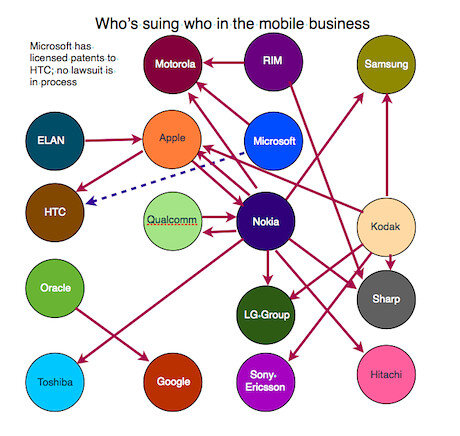
A few folks this week sent over a story in the Guardian by Josh Halliday and Charles Arthur with a graphic purporting to show
who was suing who in the smartphone space, following the news that Microsoft had sued Motorola. You can see that graphic here:

Meanwhile, someone in our comments had pointed to
a very similar graphic.
The problem is that both of these graphics are
wrong. The Guardian one admits that it was built off of the NY Times post from back in March that
that showed a similar graphic, which we
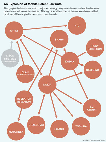
wrote about at the time. Here's that graphic:

However, Joe Mullin quickly pointed out that
the graphic was wrong and included a bunch of lawsuits that never happened. NY Times blogger Nick Bilton posted a correction to his story way back in March... so I'm unclear on why the two Guardian reporters were still using that as the basis of their own drawing.
Either way, with
Motorola suing Apple for patent infringement, the already wrong graphic was now also out of date. So, I figured
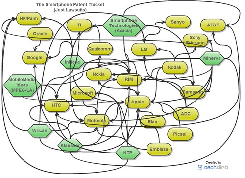
why not create my own, correcting the original errors and adding in the new information.
I ended up spending many hours on it, because once I started, I realized that to
really show the state of the patent thicket, I couldn't just include the big name companies that were suing each other, because that's only a part of the story. What about all of the non-practicing entities (so-called "patent trolls"), who were suing lots of these companies for infringement as well? Doesn't that matter in understanding the thicket? Of course, there are lots of them, so I focused on the higher profile NPE lawsuits -- the ones involving multiple defendants -- and added them to the chart too (in green). And then, I added in a few other companies who actually make stuff but have been suing as well. Once you start, it's difficult to know where to stop. There are so many companies involved in so many lawsuits, some you just have to leave out. However, I believe the image below gives you at least some sort of picture of the lawsuit situation concerning smartphones. Some of these lawsuits have settled, but many are still ongoing.

Now, here's the crazy part: this is
just lawsuits. I thought about showing licensing deals in this chart as well, but that would have killed my whole weekend (in fact, just as I was finishing up this post, I saw that
Microsoft has just licensed 74 smartphone patents from Acacia). And then I thought about including companies like Intellectual Ventures which apparently are
sitting on a bunch of other smartphone patents but haven't yet sued over them. However, I'd already wasted hours that could have been spent doing other, less brain-damaging work, and decided to leave it like this and move on.
Anyway, I'd say this does a damn good job demonstrating the concept of a patent thicket. It also explains how such thickets are hindering innovation. Anyone who wants to get into the smartphone business knows that they're facing lawsuits from a large number of the companies listed on the graphic.
Update: Someone just pointed out that Ars Technica apparently
made their own graphic, which is
really pretty.... but also relies on the same bad data that the NY Times used and corrected months ago.
Update 2: Apparently
everyone had the same idea. The folks at Information is Beautiful
made another version of the same chart... again including the incorrect information from the NY Times (though, at least they admit those lawsuits are about LCD price fixing, not patents).
Filed Under: patent thicket, patents, smartphones
Companies: htc, kodak, microsoft, motorola, nokia, ntp, rim

